Branding
In the below projects the main focus was to create a logo and full brand identity.
Project 1 - Investment and Construction Company
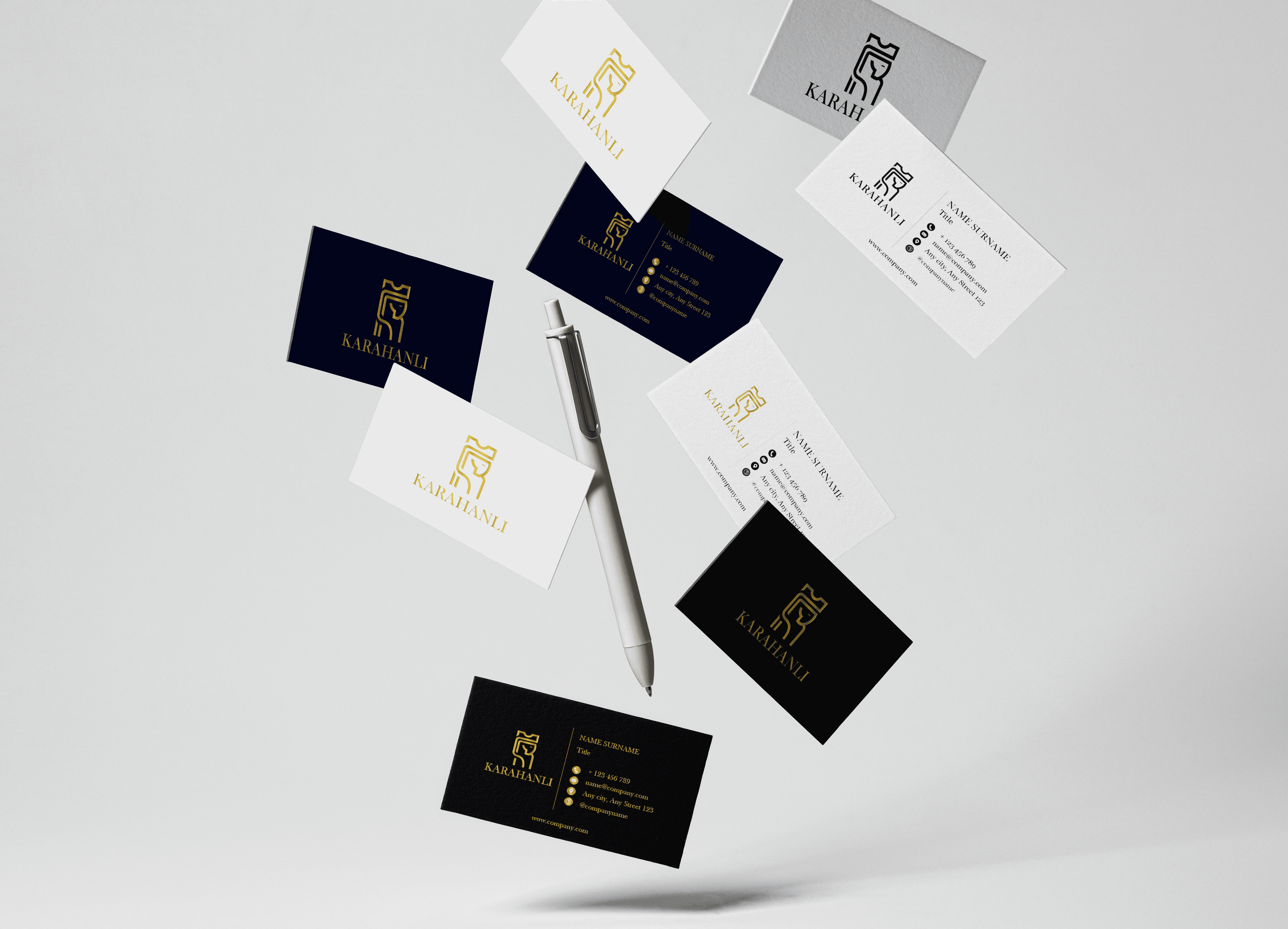
In this project case study, the goal was to create a logo and brand identity for an investment company that would give a sense of trust, have a classic yet modern look. The target audience was business owners from 30 to 65 years old both male and female.
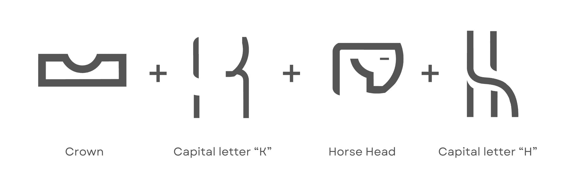
The logo combines elements that symbolize strength, reliability, and excellence in construction. The horse, a symbol of power and endurance, represents the company's robust and resilient approach to the projects. The capital letters "K" and "H" are presented indirectly, subtly emphasizing the brand's identity, as well as paying homage to the Karakhanid dynasty. The crown atop signifies leadership and superior quality in the industry.
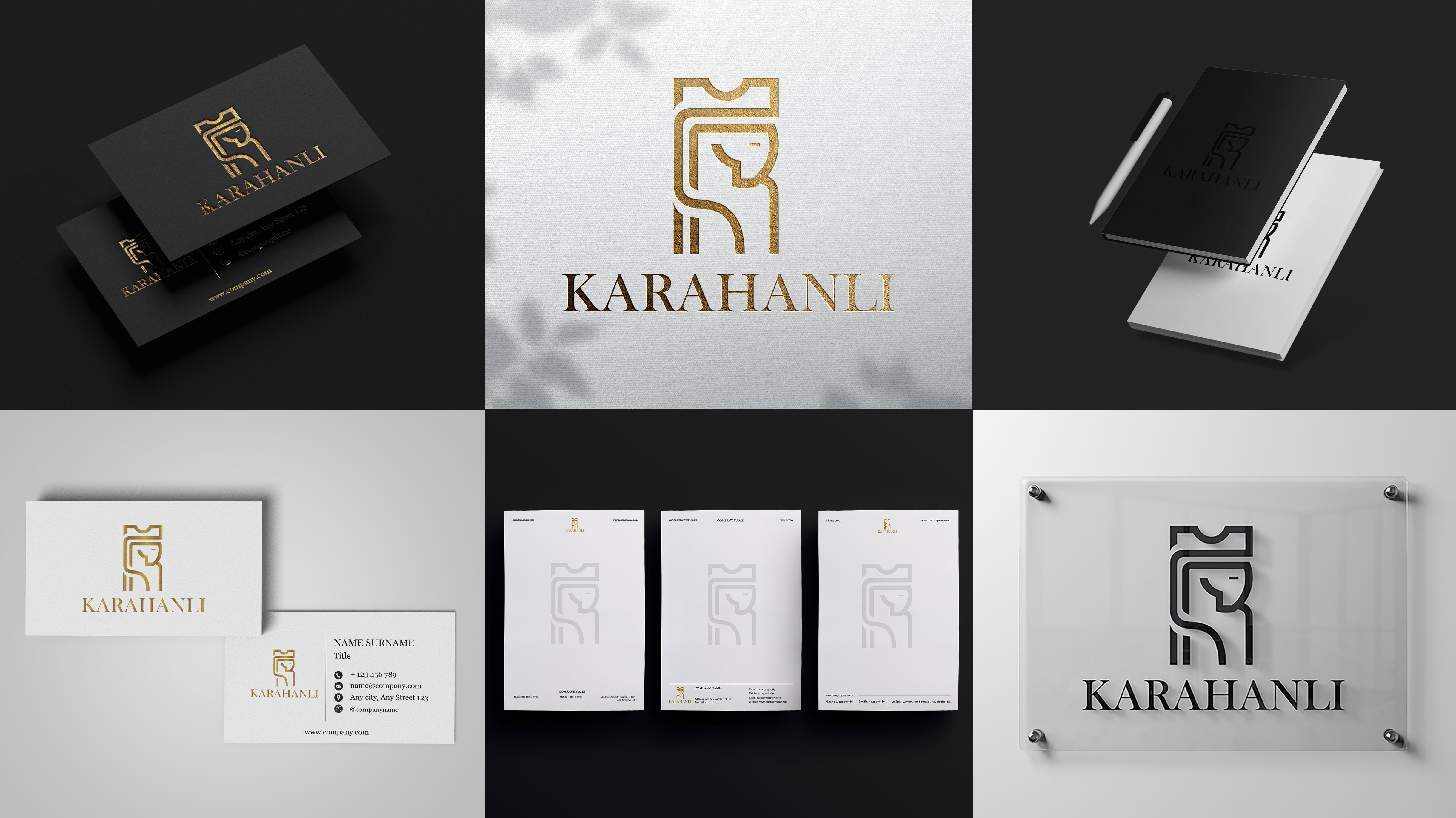
The use of the Baskerville Old Face typeface in the logo adds a touch of classic elegance and timelessness. Main color brands are gold, white and black.
Project 2 - Bubble Tea Shop
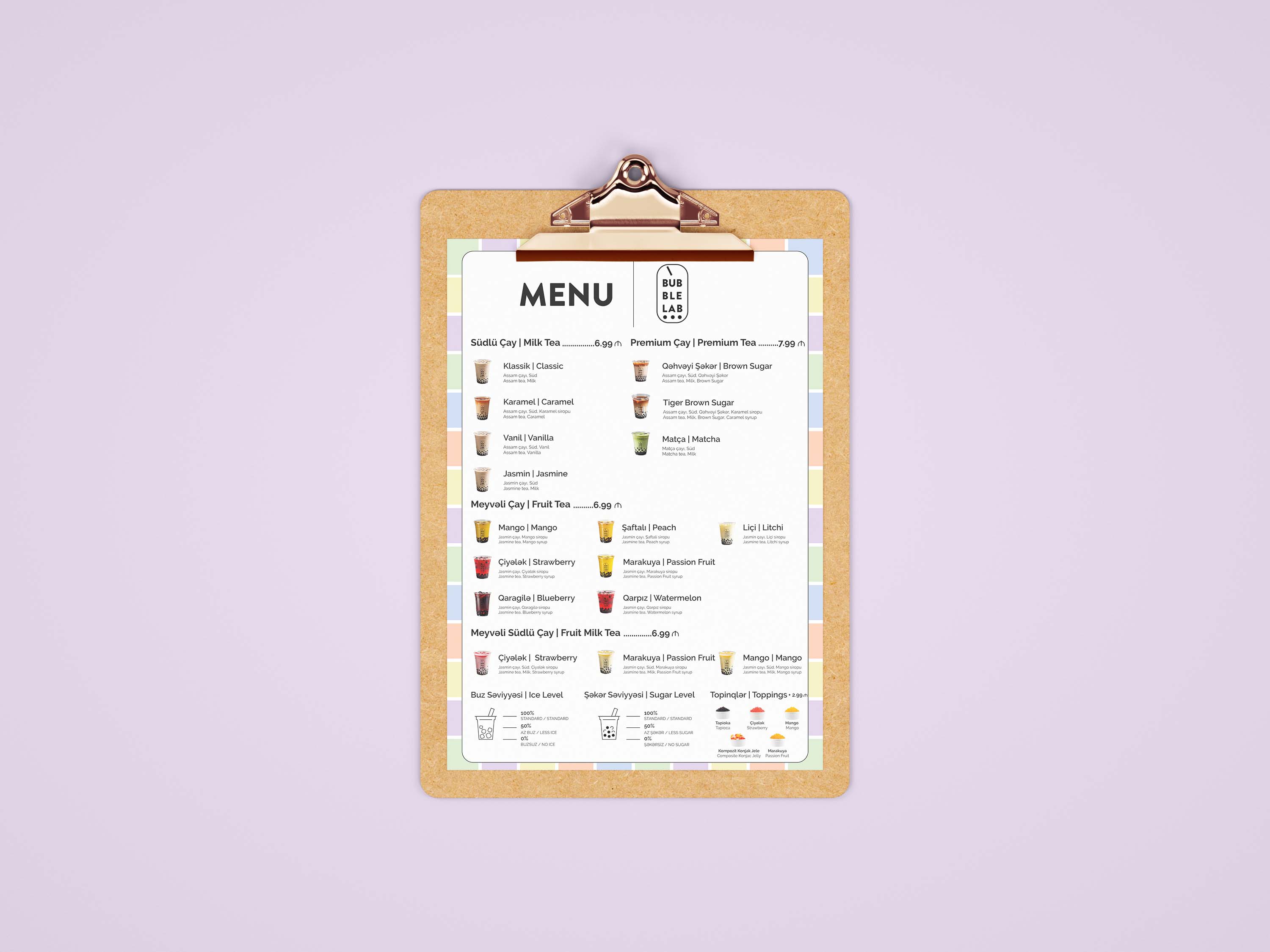
The design process started with competitors and target audience research. The goal was to create a modern-looking, minimalistic logo that would give an idea of bubble tea. The target audience was children(5-18 years old), young adults(18-25 years old) and their parents/grandparents.

The logo captures the essence of the brand: an experimental, fresh approach to the art of bubble tea. The sleek, oval-shaped outline resembles a scientific capsule or test tube, hinting at the “lab” where flavors are crafted with precision. The bold, sans-serif typography gives it a modern, minimalist, and approachable feel, while the circles at the bottom mimic the bubbles found in each cup of tea, visually representing the fun and playful nature of bubble tea culture. At the top, a tilted line represents a straw, ready to dive into the drink.

Project 3 - Investment Company
In this project, the goal was to create a logo and brand identity that would be minimal yet presentable and have a memorable icon that would represent the company's name.
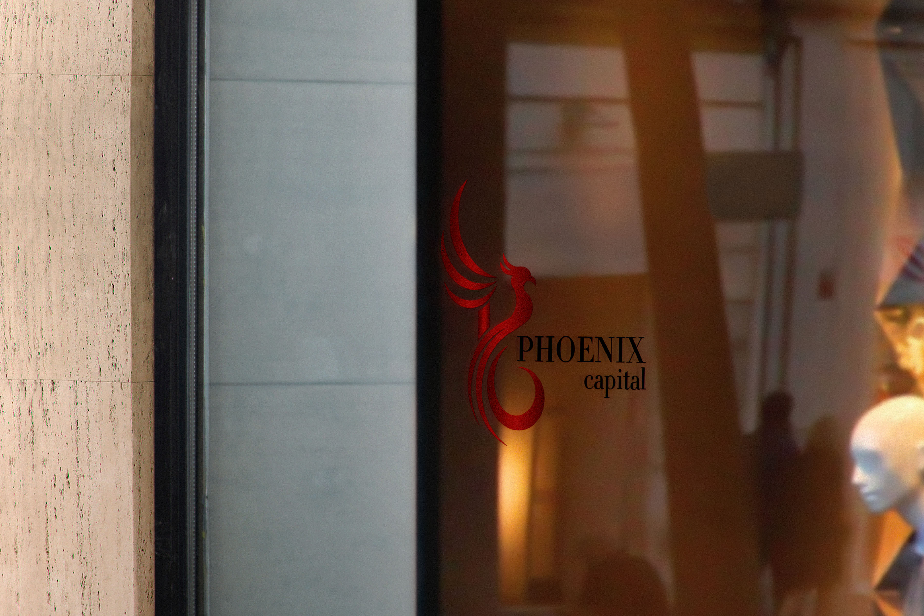
The design of the logo subtly incorporates the letters "P" and "C", representing "Phoenix" and "Capital" respectively. The "P" is formed by the elegant, sweeping curves of the phoenix's body, while the flowing tail and wings create an indirect "C", symbolizing capital growth. This incorporation of the company’s initials is seamless, blending them into the flowing, organic shape of the phoenix without interrupting the grace and dynamism of the design.
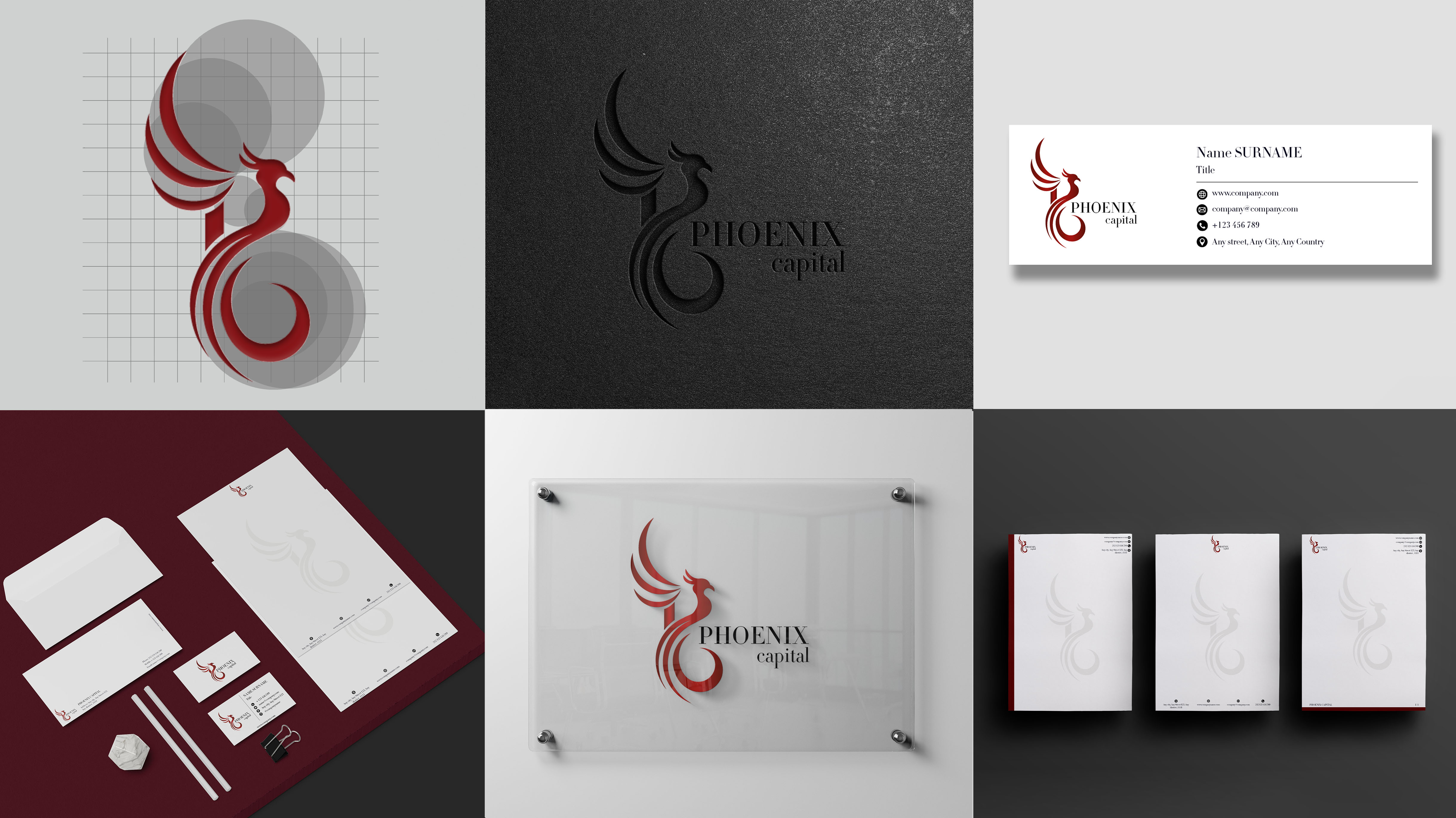
The refined serif typography complements the symbol, which speaks to prestige, trust, and sophistication.