UX/UI
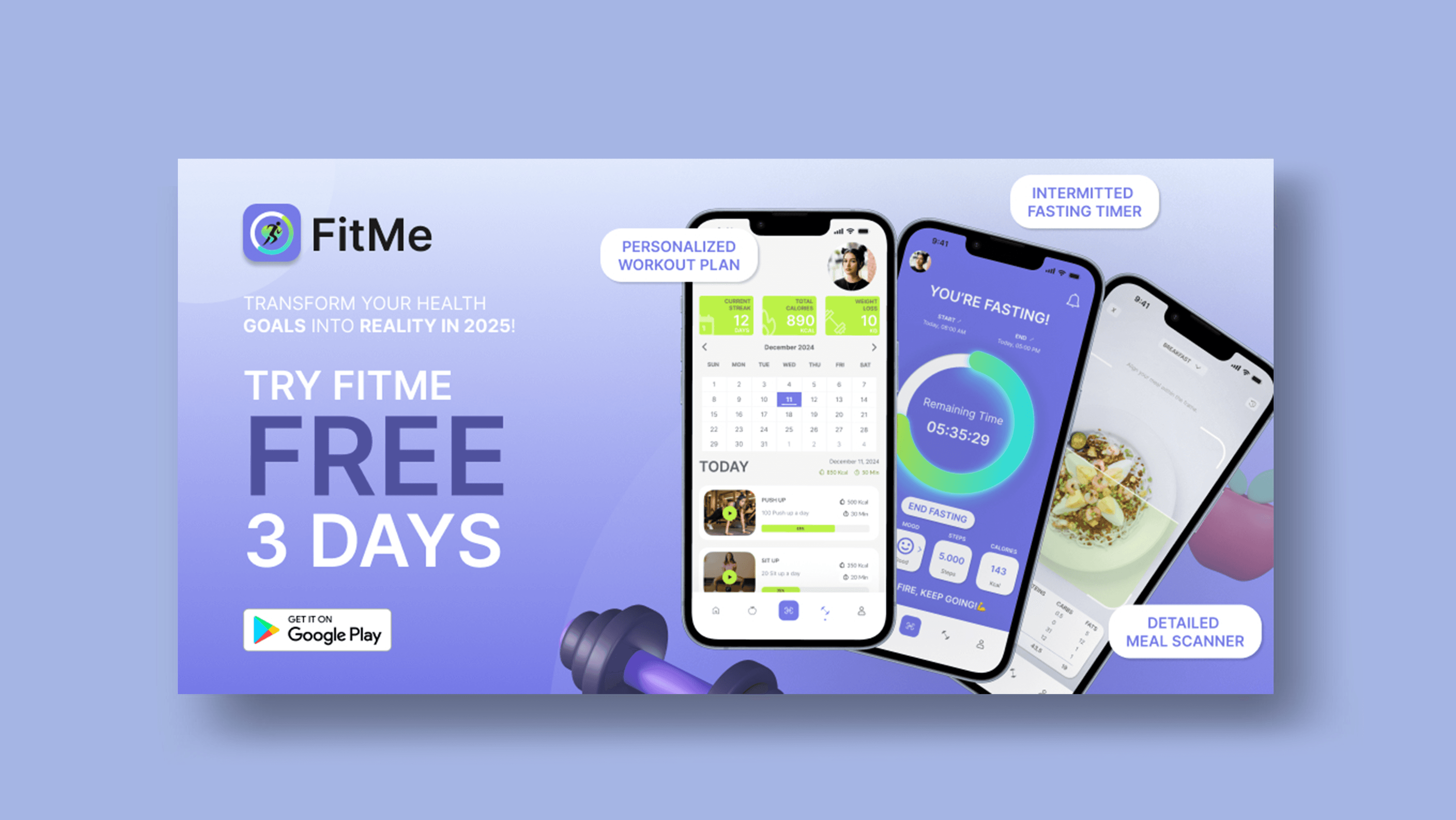
In this project case study, the task was to create an icon, New Year banner, storefront screenshots, and main phone app pages for a Fitness and Wellness app. The app offers personalized workout plans, intermittent fasting timers, and a meal-scanning feature for detailed nutritional insights.

Understanding Design Process
The design process started with user and competitor research. The app's main audience was a group of users from 15-60 years old. Throughout the design process, I concentrated on crafting an intuitive user-friendly interface that would enhance the overall user experience for every age group, be modern yet simple and not overwhelming.
App Icon and Brand Colors
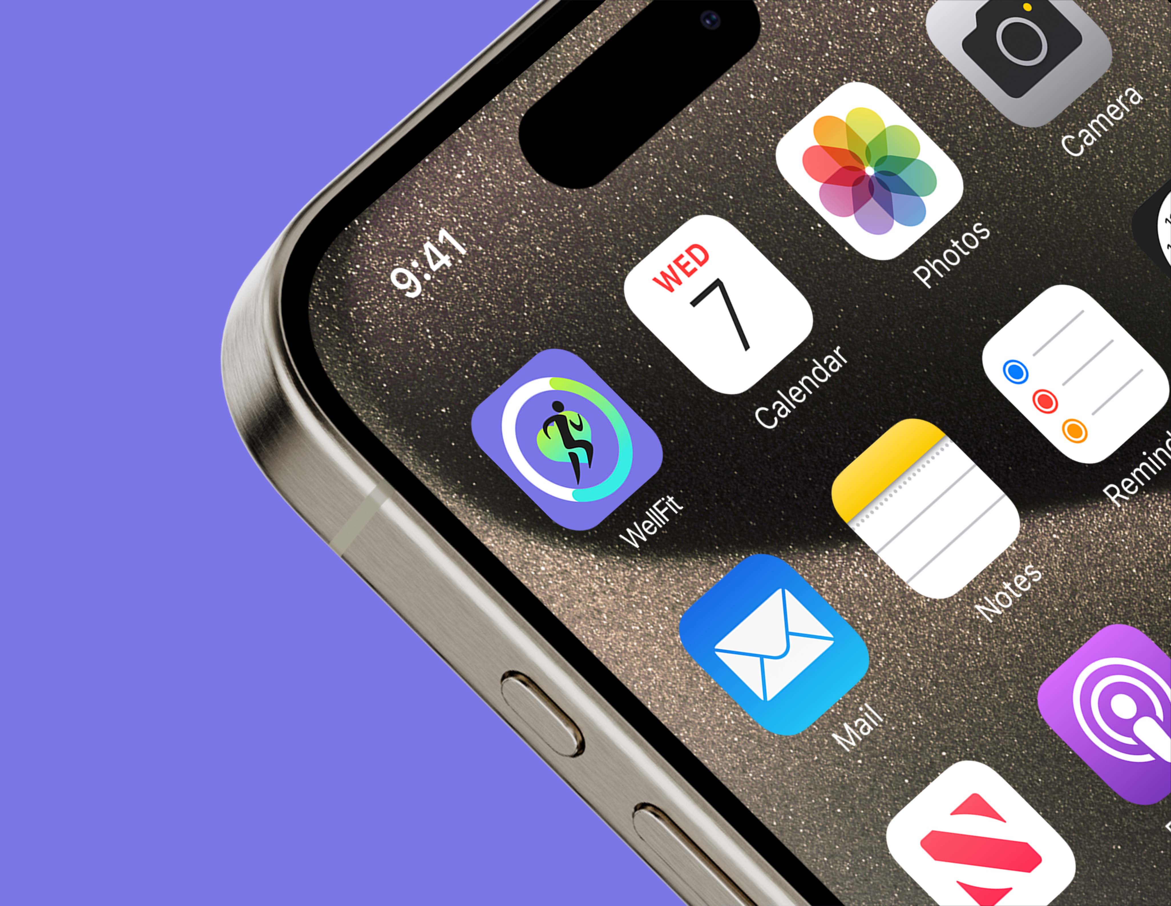
Based on the insights gathered, I decided to design an app icon that will be simple yet reflect the main purpose of the application. Each element of the app reflected a particular feature: The process ring - intermittent fasting, calorie tracking, and diet progress; Running figure - fitness, personal workouts; Heart-healthy lifestyle. The main app color was purple and accent color - lime green. Green shades represent health and balance and boost energy, while purple shades often stand for self-care and sophistication which resonates with the users aiming for a better quality of life.
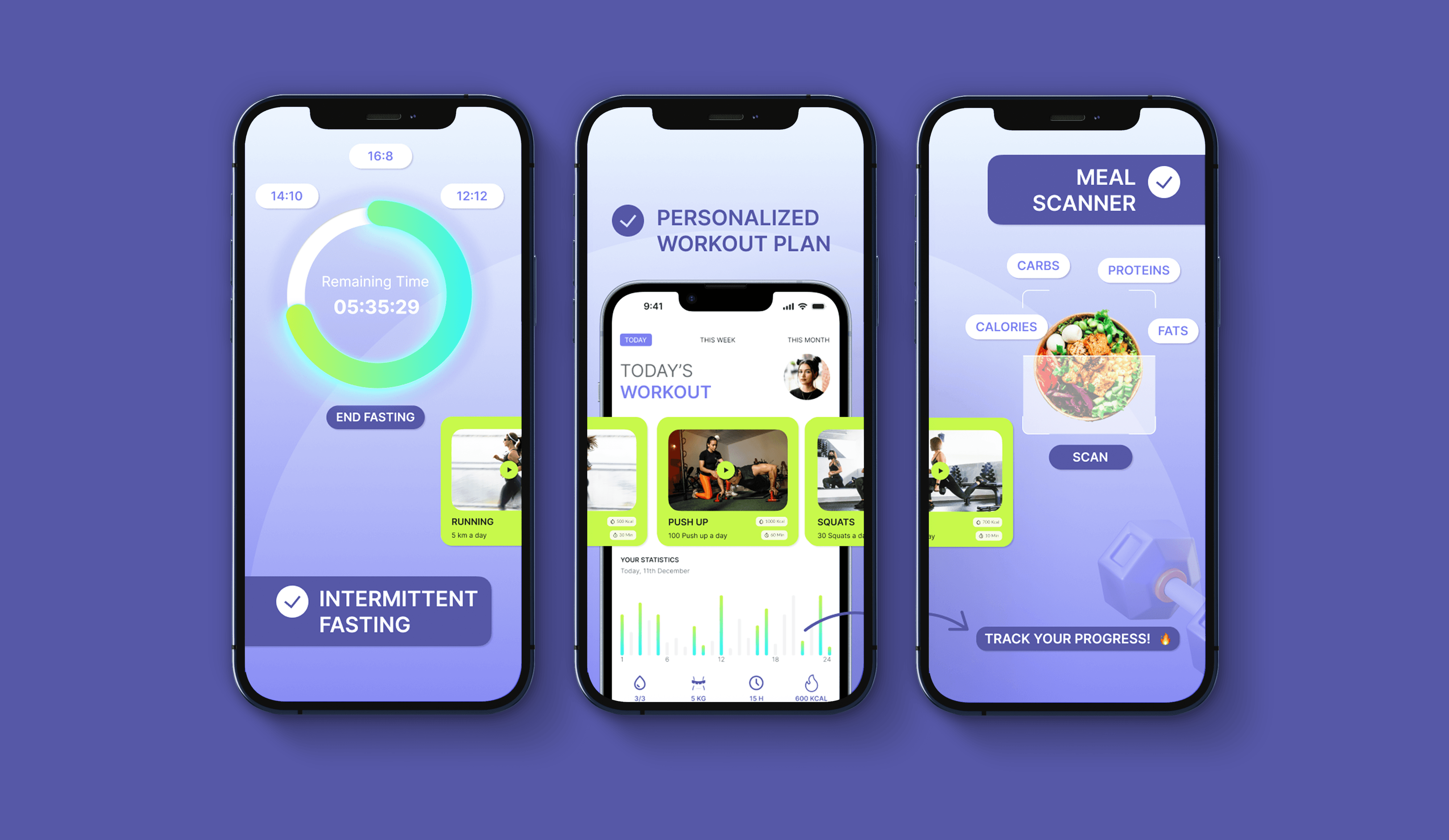
App Store Screenshot Examples
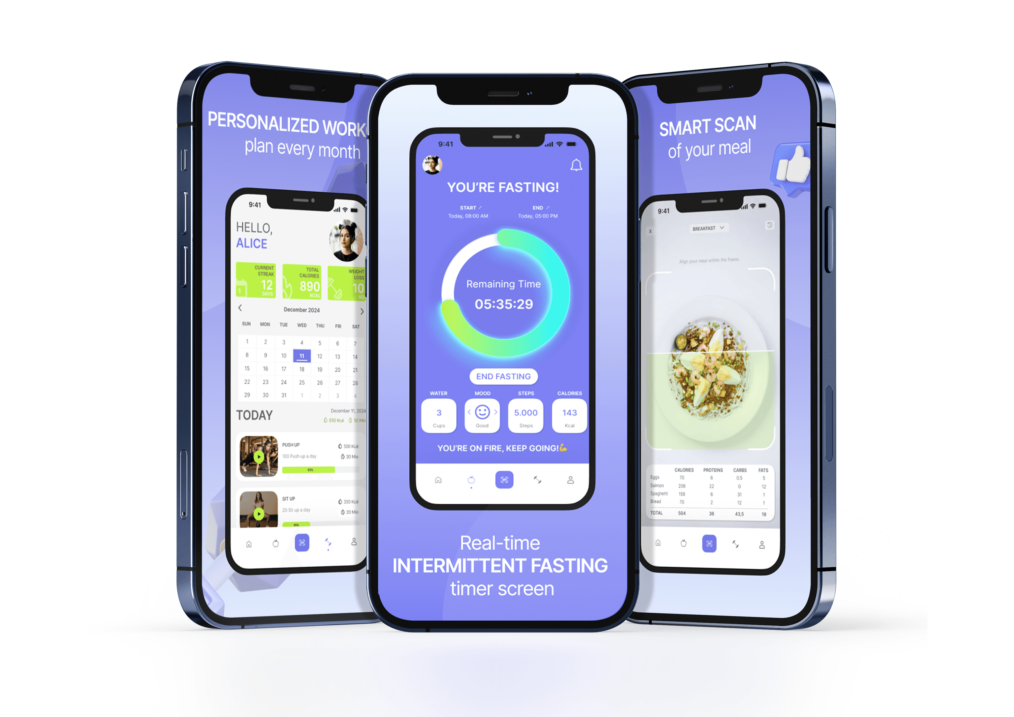
For storefront screenshots, I've highlighted all the main app features that differentiate an app from its competitors showing a personalized workout plan page, intermittent fasting timer, and detailed meal scanner.